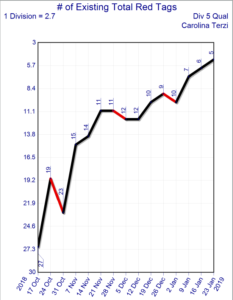
A graph that is scaled so that the top is zero or a lower number and the bottom is higher. This is for a statistic which, when it goes up is bad news and when it goes down it’s good news.
For example, if we were going to make a graph for “client complaints” to see how many of these we were getting weekly, we would put 0 at the top of the graph since we want zero customer complaints. If we take steps to reduce the number of customer complaints, we would get an up statistic, even though the actual amount of the stat is less.